All of you have seen REES46 Unified Dashboard. We managed to put together the key performance indicators, graphs, and stats, and arrange them on a single panel. Now, instead of juggling 25 opened tabs while trying to check the CTR of your email campaign, results of your traffic analysis or performance of any other marketing tool, you just keep opened one – REES46 Dashboard. It has it all.
Today’s post is devoted to our Dashboard, its widgets and the most important eCommerce KPIs. Read our guide to precise and efficient control.
A teaser to keep you reading:
Maybe you remember our article on the key vs. vanity metrics in eCommerce? Let’s give you the widgets to measure the key indicators from it as well as other important KPIs.
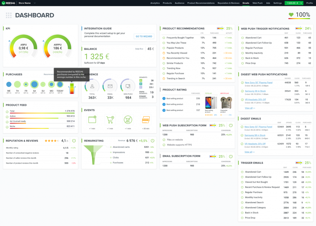
Widget “Purchases.”
Design
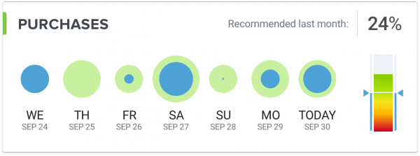
It is the base for calculating other KPIs:
- The number of monthly purchases. Not being very informative on its own, this one is used to calculate other important KPIs.
The widget shows you graphs based on the sales made during the last seven days. The blue color tells you what part of the sales was generated by REES46.
The multicolor graph on the right shows you the number of recommended purchases REES46 helped you made in comparison to the average in your niche. Taking this screenshot as an example, REES46 generated 32% of all the purchases for that store, which is a significantly higher number than the average number (the blue line near the bottom) in this niche.
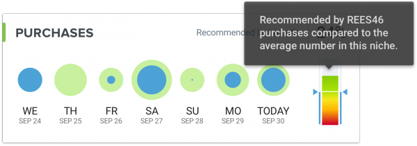
If you click on the caption “Purchases”, you’ll get to the analytics page where you can set a range of dates and change the sorting order to focus your purchase analysis, and also assess the number of sales from the product recommendations, trigger emails, digest emails as well as web push and remarketing campaigns. To see more details and a tip, tap on the bar of your choice.
Widget “KPI.”
Design
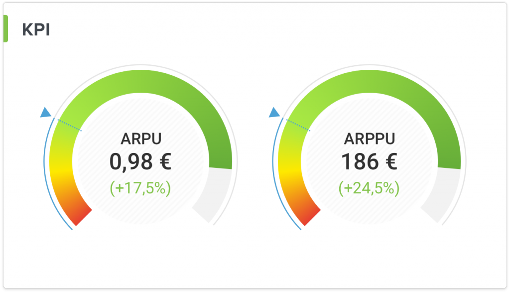
The two most valuable KPIs in eCommerce:
- ARPU — Average Revenue Per User. This graph allows you to assess the profit from each customer for the last 30 days and estimate how much traffic you need to reach your current revenue goals. By the way, cross-selling has more advantages than buying new traffic.
- ARPPU — Average Revenue Per Paying User. Did you know, it is six to seven times more expensive to attract a new customer than it is to retain an existing one? So go ahead and enable all the REES46 tools – product recommendations, emails, web push notifications, remarketing – to see this KPI grow faster.
These two also show your current dynamics: increase or drop in ARPU and ARPPU compared to the last 30 days stats. The blue line in this case represents your previous result. An increase is great. A drop means you should check if you’re using all necessary REES46 tools.
Widget “Trigger Emails.”
Design
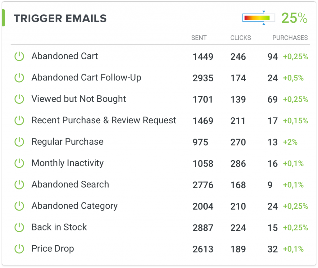
The number of sent emails as well as the number of clicks and purchases generated by them today. The multicolor graph in the top-right corner shows the total conversion rate for trigger emails compared to the average in your niche.
If you click on the caption “Trigger Emails,” you’ll get to the analytics page where you can assess the performance of each trigger scenario. For instance, here are stats for the “Abandoned Cart” scenario in one of the stores:
You can see (top to bottom):
- The number of emails sent. This one is used in the calculation of other related indicators.
- Open Rate. The ratio of all opened emails to the emails sent. A high open rate tells you that you have done a good job segmenting your audience and came up with a catchy subject and header for your email copy.
- CTR. The second line from the top tells you how many opened emails got clicks on recommendations in them and the third – the same number of clicks in relation to the total emails sent.
- Bounce Rate. A high rate of emails never delivered to the recipient is a point of worry and means you should check the accuracy and relevance of your customer database. Otherwise, you’re good.
- Email conversion rate. The most important indicator. Here again, the first % from the top is the recommended sales compared to the number of click-troughs and the second — compared to the emails sent.
More on the topic: Trigger Email to Retain Your Customers
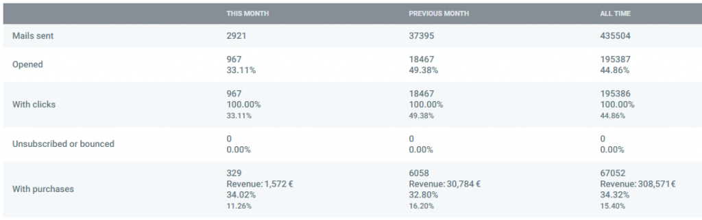
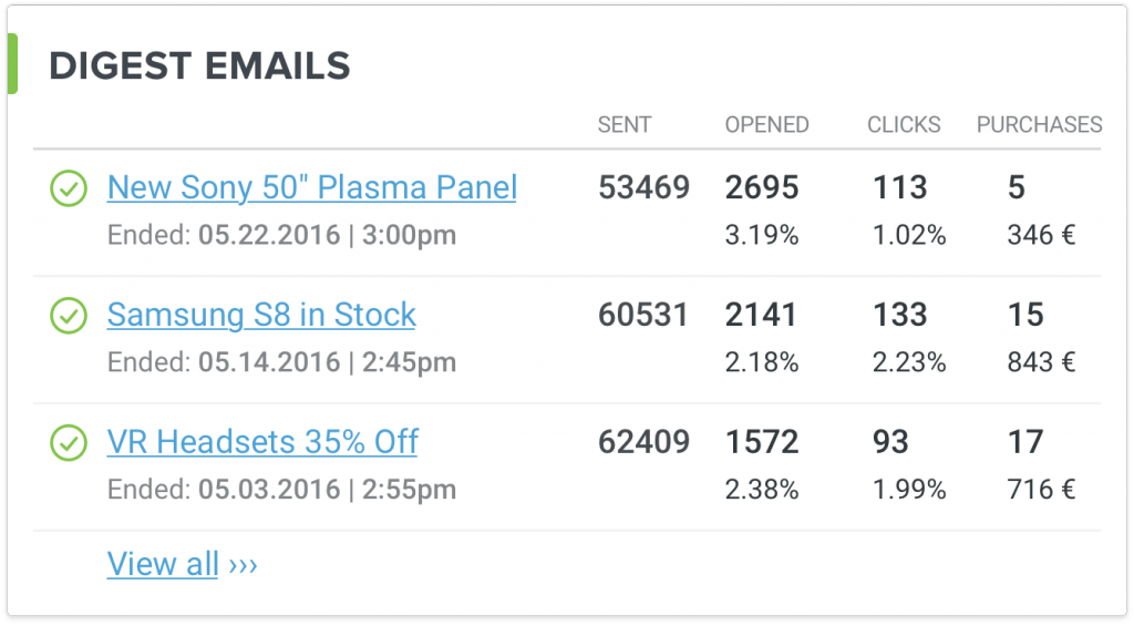
Widget “Digest Emails.”
Design
Everything you saw in the “Trigger Emails” part, except for your regular email campaigns. Again, clicking on the caption, you will land on a detailed analytics page.
Widget “Audience.”
Design
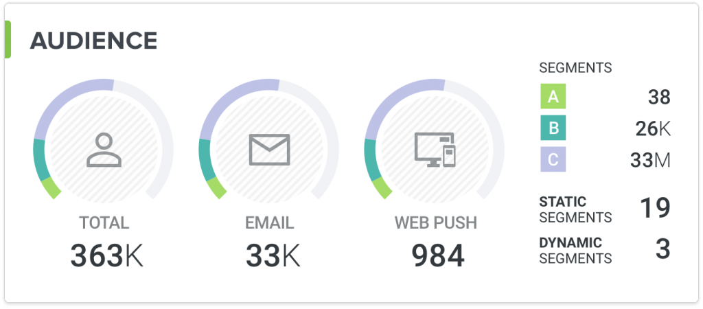
The stats of your segmented audience:
- Total audience. The total number of visitors, who visited your website.
- Email audience. The number of visitors, who subscribed to your emails.
- Web push audience. The number of visitors, who subscribed to your web push notifications.
- A, B, C segments. Your total audience automatically divided into the three segments by their on-site activity and financial input. The segment A — your loyal spenders for the last two months (15%), B — more or less frequent buyers for the same period (35%), C — low-activity customers for the same period (50%). The C segment is typically motivated by special offers and discounts. Otherwise, you risk those turning into your “sleeping” customers.
Widget “Web Push Triggers.”
Design
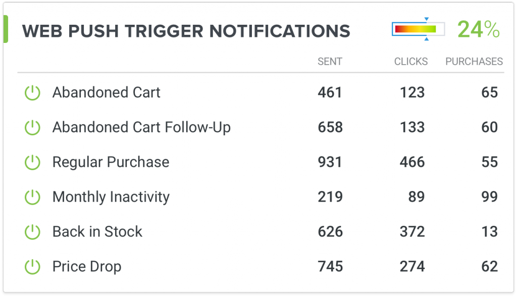
The stats for your trigger web push notifications. Those are today’s stats. They are the same as the email stats: sent, clicked, with purchases.
If you click on the caption “Web Push Triggers,” you’ll get to the page where you can access detailed stats for each scenario, same as with the emails.
Widget “Web Push Digests”
Design
The same stats as above (sent, clicked, with purchases), except for your regular web push campaigns that you create, design and launch manually, at will.
More on the topic: Effective Web Push Marketing: 2 Big Cases
Two Widgets “Subscription Form”
Design
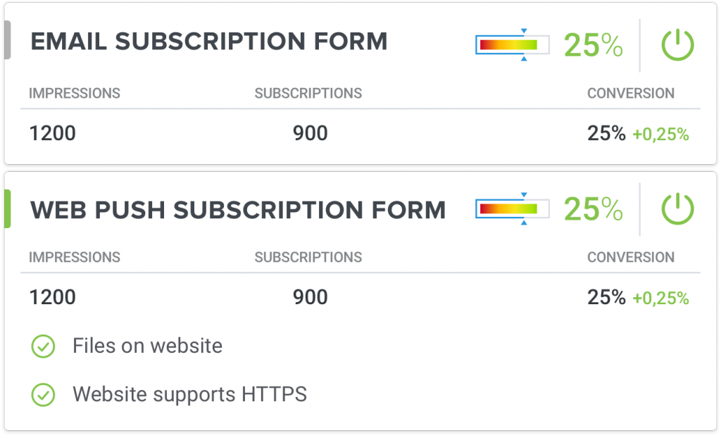
The response of your audience. What does your audience better react to: web push notifications or emails?
Gray colors tell you the form has not been activated yet, while green colors – the opposite. A subscription popup is the easiest and most effective way to enrich your customer database with contact details, so the sooner you enable both the better. Using REES46, you can send web push notifications from non-SSL websites, so HTTPS is not obligatory.
“Product Recommendations”
Design
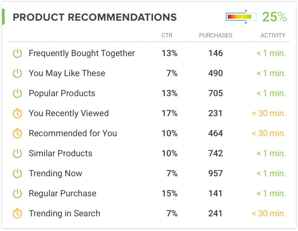
The efficiency of the enabled on your site blocks with product recommendations:
- CTR. The click-through rate for the recommended products.
- Purchases. The numbers of purchases generated by on-site product recommendations.
- Activity. The time of the last event.
The icon on the left changes if the page with the recommendation block has not been requested for the last 30 minutes. The minutes on the right display how long it’s been since the page with the block has been requested by a visitor. Those two both help you assess the efficiency of a particular recommendation block in your store and detect a technical problem (e.g. when you embedded a block, but the widget tells you it hasn’t been displayed for a day or longer).
“Abandoned Cart Remarketing”
Design
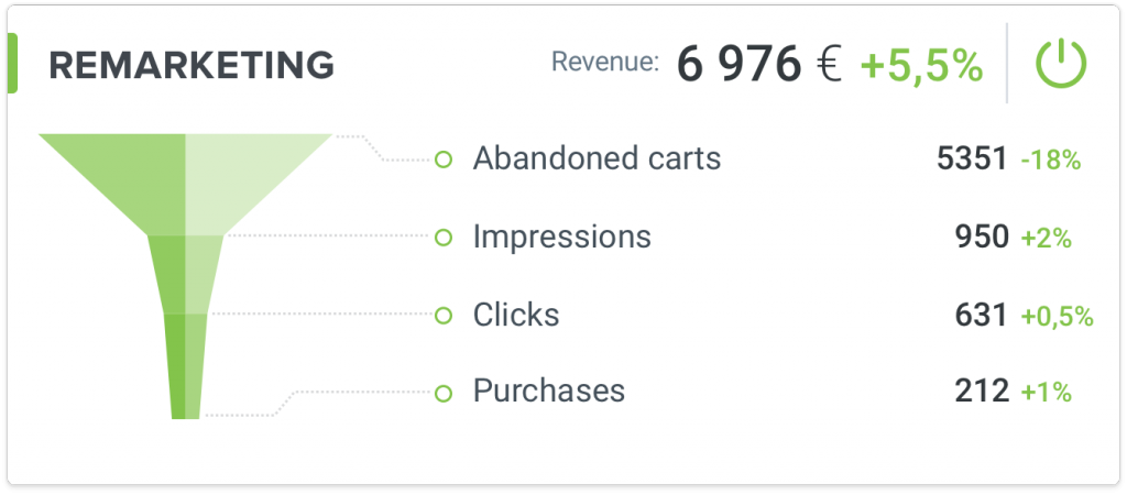
All the rates connected with the funnel: from the moment of a cart abandonment event to purchase.
In the top-right corner, you can see the revenue generated by the remarketing tools.
More on the topic: Customer Lifecycle Made Easy
Control and Improve
The REES46 Unified Dashboard gives you a sharp overview on your online store’s KPIs so that you’re always able to spot a problem at an early stage and fix it on time.