Email marketers spend weeks conceptualizing the email campaign or program, crafting the flow and design, choosing a promotional offer you can’t refuse, and tailoring their messaging to a specific audience and need. The subject line often appears at a later stage of the process as an afterthought without the same amount of consideration. From the viewer’s perspective, however, the subject line is where the campaign starts. If you fail to captivate them in that moment, it’s probably also where the campaign ends.
In our previous posts, we’ve touched on the topic of subject lines. Today, let’s break down the anatomy of subject lines anatomy and the psychology behind what makes people click.
Anatomy of a subject line
When you send an email directly from your inbox, the only field you edit is the subject line.

However, when subscribers views the email in inbox they see three components: “From” which is your name, the subject line, and the preheader (in the event there is none, this field would display a preview of the first line of text within the email).
![]()
As mobile opens statistics increase, we also have to consider mobile view which is slightly different. Depending on the device, recipients may see anywhere from 30 to 60 characters of the subject plus additional wrapped preheader text.
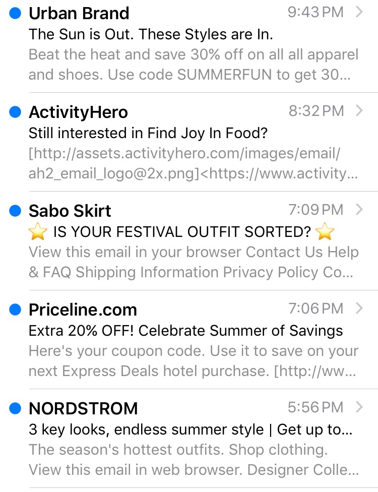 The overall view and the coherence of the three components are deciding factors for whether they click to open or not. Your goal is to leverage the character space for both subject and preview text to it’s highest potential to maximize the open rate, which will be one your main campaign success metrics.
Psychology behind the open rate
Without going into discussion on what flags emails as spam (you can always revisit it here), let’s take a look at what makes a subject line clickable and how to stand out amid the clutter of a typical modern-day inbox.
The Benefit subject line
One of the most common types, this subject line hints at the contents of the email while touting a specific benefit. For example:
- A guide to flying around the world at every budget
- Tip to try: Go monochrome
Adding in the numbers—“the 5 best…” or “10 tips on…”— multiplies the benefit effect. It shows that you’ve done the work for the reader and are providing them with a curated list of “the best of the best”.
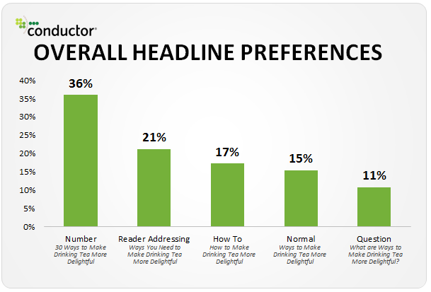 The number directly correlates to the value, so you have to make sure that it’s not too high or too low within the context of the benefit.
- 10 ways to wear your black dress
- 15 killer content marketing tools
- 3 biggest interview mistakes
The Personalized subject line
The recipient’s name in the subject line can establish a personal connection between the sender and recipient and can boost open rates. Still, this tactic is overused and savvy readers are no longer falling for the trick. Personalization is not limited to addressing recipients by name, however. When done on a more sophisticated level it can take open rates through the roof.
Leveraging other characteristics like demographics, location, purchasing behavior, activity, preferences, company and title name can hook the targeted audience. The exclusivity of the message increases the chances of engaging them:
- Lifehacks for your IPhone
- It’s back! Your favorite item restocked
- Attract new customers to your company with $50 in advertising credits!
When certain data is not available and you are operating on assumptions about the recipient, it’s best to keep the targeting narrow. Avoid catch phrases, like in the notorious Google ad “Every owner of a PC should have this game”. Umm, ok Google, I don’t own a PC and I am not even into gaming.
The Seasonal subject line
Perhaps the most trivial of all are the seasonal subject lines, or subject lines that leverage current and topical events for relevant messaging. These are not only fun to write but also fun to click on. The tough part is, once again, breaking through the clutter of hundreds of “12 days of Christmas” and “Be my valentine” messages. It might be worth spicing up the pitch with some puns and emojis.
- Roll out the red carpet! Up to 40% off sale ends tomorrow (Snapfish, using Oscars weekend)
- Mesh: Beat the heat (Nike summer shoe collection)
- The Remedy For Dad Bod (Father’s day promotion from Your Tea)
The Curiosity Gap subject line
While benefit subject lines are straightforward with their content, mystery subject lines make a play on the human nature of curiosity. These subject lines are the opposite of direct but no less compelling or successful.
- If you’re not watching these, you’re missing out
- You forgot something
- We are in your home
The last one with its creep factor (which takes a humorous turn when “we” is revealed to be wall decor) is from Social Print Studio, a hipster print company from San Francisco that has hacked the subject line game with its “out of the box shock value” approach. or will be reassured that nothing fishy is going on only by opening the email.
The Questioning subject line
Where there is a problem, there is a solution. The question subject line is designed to identify a pain point and provide an answer to it within the content of the email. The key is to identify what are the main problems recipients may be faced with and how your content, product, or service addresses that issue.
- Summer outfit struggles??
Also, you can always make this type of subject line even stronger by revealing the solution in the preheader, like Forever 21 does, making a statement in their bold and flirty brand voice:
- Summer outfit struggles?? What to wear when you wanna look hot, but it’s hotter outside
The Humor subject line
In some of the examples mentioned above you may have noticed that some brands like to push the envelope. After all, nothing is more delightful than a good pun. However, humor is a subjective matter and needs to match the brand voice. Some brands, like Virgin and J Crew, have embraced the freedom of using humor in their marketing communications. Others, that like finance, healthcare, or tech products, may not be able to have as much fun in their messaging. Finding the acceptable threshold of humor that resonates with the reader can provide that occasional lift in open rates that every brand can use. Here are examples of how Virgin and a local yoga studio in San Francisco pun around in their messaging for Valentine’s Day promos:
- Love at first savasana
- Land a smooch ?
An alternative to puns that can be equally smart and relatable, is common sayings:
- Save $$ for a rainy day
- Ready to reel in a deal on some wheels?
Once you understand the psychology and motivation behind the opens, there is no need to stay within the parameters of one type – possibilities are endless. Mix things up to create your dynamite formula:
- A question with Personalization:
Need help with inventory management? QuickBooks is not just accounting
- Humor with Curiosity:
Secret Sale, no peeking! j/k, totally peek…
- Seasonal with Benefit:
How To: Summer ’17 Wedding Essentials
Preheader pitfalls
If your ESP doesn’t have a form field for the preheader, then the email appears in the recipient’s inbox with a trailing line of text after the subject line. This can get ugly if not curated; best case scenario, it’s your headline, but most likely it’s “view online” or worse, depending on how messy your HTML code is.
![]()
Some of us may not even realize the power of this small mishap. Essentially, you miss out on the opportunity to maximize the potential of that preview text, or worse, you are confusing the reader with strange characters appearing in the preview triggering them to unsubscribe.
How to add a Preheader
There is a scrappy way to deal with the preheader by making sure that the first line of text provides a snapshot of the email. The issue with this is that the preheader copy ends up as part of the email content once it’s opened. This could take away from the design flown and clutter your super succinct headline or greeting. Not ideal.
Here are two common fixes:
- Add preheader text in the top left corner above the email content. Here is how to do it manually:
<body>
<div>
Preheader copy
</div>
</body>
Many companies use this method, even though the text sits right above the email shell header and precedes the brand logo. Aesthetically, not the best option.
- Make the pre-header text invisible. It will still sit at the top of the header but will not be seen in the design. How? All we have to do is make it the same color as the header background. Here is the code snippet that makes it possible:
<div style=»display:none;max-height:0px;max-width:0px;opacity:0;overflow:hidden;»>
Preheader copy
</div>
- There is another option that doesn’t require any manual coding.
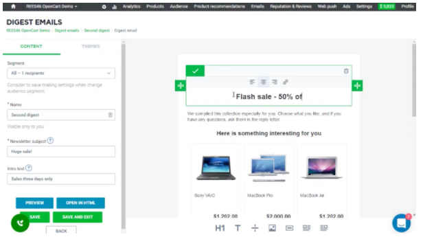
The REES46 visual email creator and editor can be launched directly from your store and has a special form field for preheader. All you have to do is simply add the text to the form field and you are good to go.
Preheader copy
Preheader’s main purpose is to enhance the subject line or serve as the secondary subject line.
- For example, if the subject line is a question, the preheader should be the answer.

- If it’s a survey, the subject line can be a call to action, while the preheader can be the reward.

- If there is a mystery offer and a secondary offer, the latter goes into the preheader.

- Similarly, the newsletter can highlight primary content in the subject line and secondary content in the preheader.
![]()
Size matters. Or does it?
As email marketers, we lean towards making subject lines short and sweet. However, business and revenue goals may necessitate marketing a complex offer that is hard to fit within 50-70 characters, let alone 30-40 characters (if viewing on mobile devices). So the question arises: does size matter?
There are different schools of thought on the subject. Logically speaking, if there is a part of the subject line that is not visible in the inbox preview, it doesn’t have any bearing on the open rate and subsequently on the conversion rate.
A research study conducted by MailerMailer in 2012, the early mobile days, when most companies had very little targeting strategy, concludes that out of 1.2 billion emails, readers opened emails most frequently with a subject line length of 4-15 characters. The number of opens dropped significantly after 51 characters.
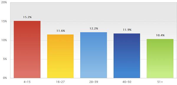 A similar research project conducted by Return Path just a couple of years, in 2015, later demonstrates a different dynamic.
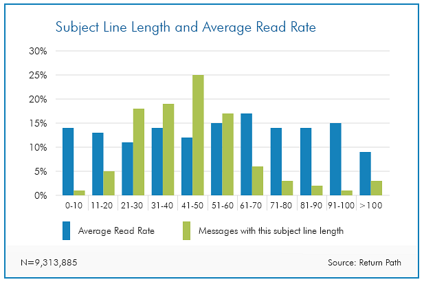 The general rule of thumb in email marketing is that if something is true today, it is likely to change as soon as a new generation of devices appear on the market. Mobile technology and Big Data have changed the way emails are created and the way they are processed. Much of the data available on the subject today is either outdated or not statistically significant. The only way to understand how readers engage with subject lines for a certain industry, product and season, is through testing.
Testing
We test because we know that not all client databases are created equal. We know that individual habits may change over time as technology and people change. We know that open rates are not standard across the board or not even within a particular industry. So the way to understand what works with a given audience is to test.
The most traditional way of testing subject lines is A/B testing. Within the A/B testing methodology, there are multiple characteristics that can be tested.
- Offer vs. no offer
- Long subject line vs. short
- Personalized vs. non-personalized
- One primary content vs. the other
If you are testing the brand voice or positioning you can have more than two test segments.
To perform a test it is important to make sure that only one variable is changing, in this case, the subject line. The content of the email must be the same. Some ESPs allow for a random audience split, others may need a manual upload of lists to corresponding versions.
- Deploy a test to 10% of the customer base splitting them 50/50
- Wait 24 hours, check results, choose the winning subject line
- Then launch the email with that subject line to the remaining 90%
The recommended timeline is not set in stone. If time permits, you can wait 48 or 72 hours, but in most cases, opens after 24 hours are insignificant. We also have to make sure that we are looking at unique opens.
The Gist
If you are seeing lower than usual open rates for a particular campaign, that means the subject line was not strong or compelling enough to engage the reader. For us, it means that we made an incorrect assumption about customers’ needs or we simply didn’t incite their motivation or challenge their curiosity. Regardless of the cause, we must always put ourselves in readers’ shoes as we craft that subject line that will hook them. Mix things up, change your approach, don’t forget the preheader, and continuously test and optimize. We hope that your open rate improves. Good luck!