“Not Found” page is way more than a simple error page. It’s a breaking point in customer experience, and at the same time a good opportunity to get customers to the purchase. This is especially true for online retail where you must squeeze the most out of every page.
According to the statistics, half of all the stores that use product recommendations, place them on their 404 pages.
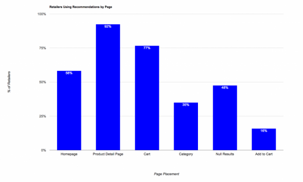 But it’s not the ultimate way to make the 404 page work. Let’s check some examples.
Wrong #1. Clean and White Like Snow
If there is no design and all visitor can see is a blank white page, she’ll just run away. A 404 page like this will make your visitor think the site down and want to go to “another one I that is good”.
Even if not, your reputation as a professional is already smeared — your website if your public face and what can people further expect if you refuse to pay attention to that?
Wrong #2. Simple Design, No Redirection
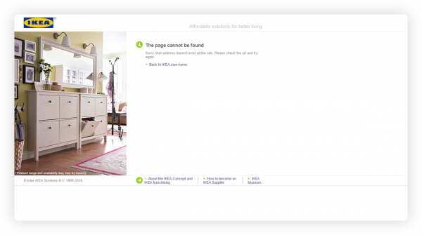
A common situation: simple 404 Not Found page. Major part of the visitors are savvy enough to understand where to click to go back a page. But it shows your neglect and provokes negative emotional response.
This situation may be pardonable for a very big renown retailer like IKEA but for an average online store it’s a straight put-off.
Wrong #3. No Design with Immediate Redirection to Home Page
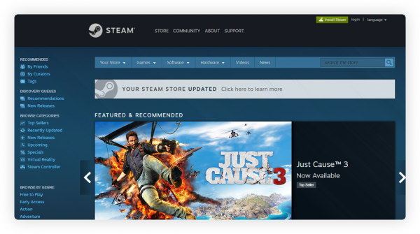
A very controversial decision — skip the 404 page and bring visitor straight to the home page.
Another case is an outdated link to Flash Sale page that doesn’t exist — it a common case with marketing emails. A new client clicks the link, gets redirected to the home page, sees no special offers and finds current prices offending — goodbye, potential patron!
By using redirection, Steam forwards users to the main page
Wrong #4. Drastic Difference from Other Pages
15 years ago 404 pages looked like a white list with a few lines on it. No menu, no navigation — purely informative.
Somehow some still think it’s good to uphold this tradition. But do they ever stop to think why? In early 2000s traffic cost so much and bandwidth was so low it was easier to concentrate on cost reduction than on the customer.
15 years later sky is the limit and something amazing is finally happening — from national advertising online retail is massively switching to local situational marketing.
Oldschool is no more cool. Newegg chose to ignore this fact.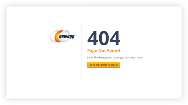
Wrong #5. Navigate Your Way Out with Site Map
Site maps today are an appendix to the website. Everybody is used to user-friendly interfaces with instructive menus. Placing a site map at the 404 page may be a poor solution when you can use the page for something much better.
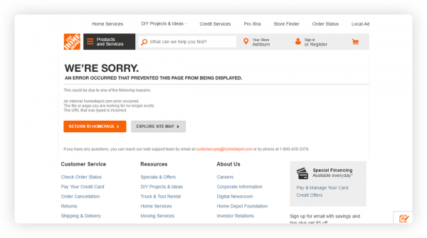
404 Homedepot either takes you to Home page or lets you explore their site map
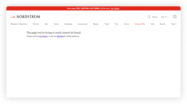
 404 Page Design at Nordstrom doesn’t even try to make up for the error
Wrong #6. Design for the Sake of Design
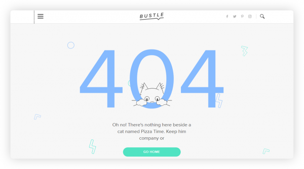
404 page tells the visitor there is a problem. However cute the design may be, it still doesn’t solve it.
Look at all this free space. It holds so much potential.
Right #1. Search Is Included
A good gauge of a superior seller. Especially if it is an intelligent search or at least a search tool with personalized search results.
Amazon’s 404 is kind of cute but check the search is here.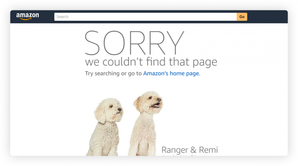
Right #2. Links to Popular Categories or Hot Sales
One of the easiest options to make up for 404 page is a link to a popular category or a hot sale. Even if you don’t use personalization, it still has more conversion potential for an average store, than cute pandas.
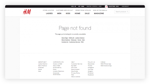
H&M’s 404 features links to popular categories to help the visitor stay interested
Munchkin 404 offers 10% discount 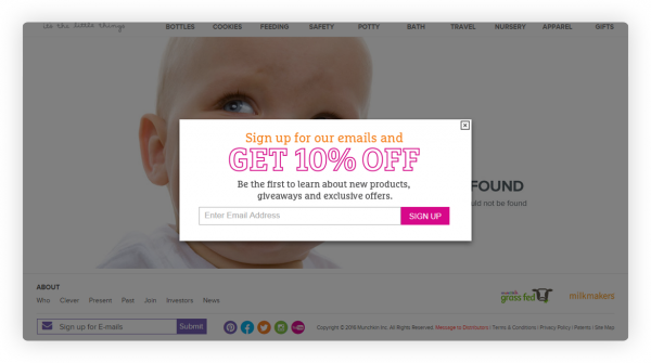
Right #3. Contact Our Support
Isn’t it a good idea to suggest visitors contacts support if they constantly encounter problems on your website? Helps you look like you’re taking care of the visitor and saves you time on finding bugs on your site.
Wiley is a good example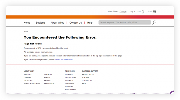
Macy’s 404 offers to visit customer service online and get help 24/7.
Right #4. Spot-on — Product Recommendations
Modern technologies allow us to be very productive. One of the options with the highest conversion rate is a 404 page with product recommendations tailored personally to each visitor.
This practice has been acquired by many leaders in online retail and is a highest trend in modern eCommerce:
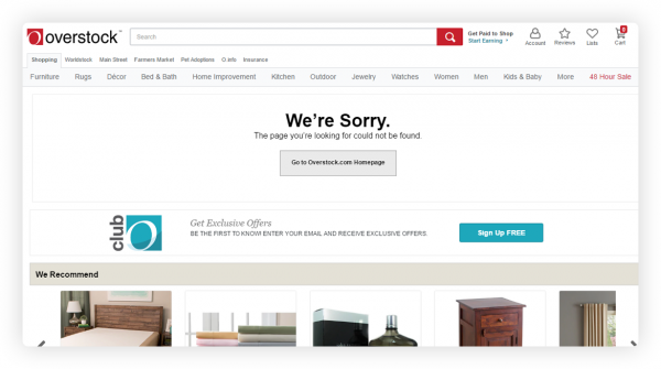
Overstock has a “We Recommend” block right on 404 page
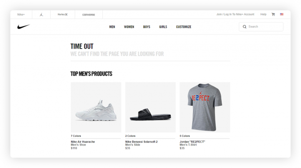
 Nike’s 404 hits a visitor with relevant selections of recommended products — men’s, women’s and even kid’s.
All in all,
5 years ago a page looking like an easter egg would make you smile and think how cool the company is. The aim was to entertain the visitor.
Today this practice becomes more and more outdated. Minimalistic design is no more — people don’t need it when they can have a page with full navigation, menus and recommendations that can actually help them find what they want.
With current trends, productivity has been ushered in, ruling over emotional response.
Today’s typical 404 page has:
- Small explanation why the visitor is on this page with a few tech details
- Support contacts
- Links to the main pages: home page and product catalog
- Links to popular categories and weekly hot deals
- Blocks “You Recently Viewed” and “Recommended For You”
- Top menu and the footer
- Search box in the top menu with a sort of “Wanna try again?” call-to-action
The easiest and most effective way to primp up your 404 page is personalized product recommendations.
REES46 can add product recommendation blocks not just for 404 pages. While carefully choosing optimal strategy for every. Take a look at the complete map:
| Page | Type of recommendation blocks | Profit for your store |
| Home Page | Popular Products | Your customers see personally tailored selection of products |
| You May Like These | Your customers find most fitting alternatives based on the browsing history | |
| Trending Right Now | Your customers see the products that were bought during the last 10 minutes | |
| Category Page | Popular in This Category | Your customers see personally tailored selection of products popular in the category and find what’s needed |
| You Recently Viewed | Your customers can always return to the previous viewed items through this block | |
| Product Page | Frequently Bought Together | Your customers see complementary products |
| Similar Products | Your customers are able to compare via a selection of alternative options fitting the price range | |
| Out of Stock Page | Similar Products | Your customers are able to to complete the purchase looking at a selection of alternative items fitting the price range |
| Shopping Cart | Frequently Bought Together | Your forgetful customers see a selection of accessories and remembers to make a complementary purchase |
| Customers Who Bought This Item Also Bought | Your customers are enticed into additional purchasing via the choice of other people with similar preferences | |
| 404 Page | You May Also Like | Your customers find the way out of the dead-end via a personally tailored selection of products |
| Content Pages | You May Also Like | Your client is enticed into purchasing on any content pages of your website: blog pages, article pages and so on. |
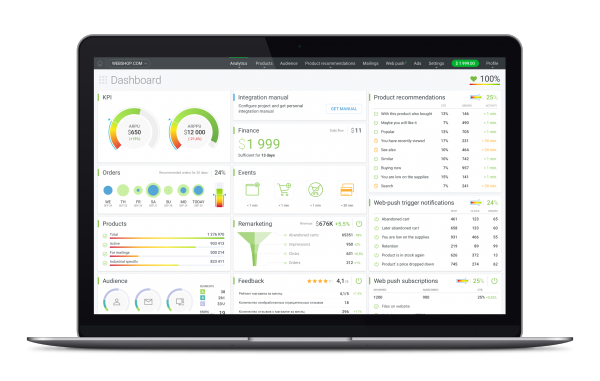
To always stay in touch with the metrics, REES46 has a comprehensive dashboard with graphic widgets, friendly hints and detailed reports:
Hi there to all, the contents present at this website are actually awesome for people
knowledge, well, keep up the nice work fellows.
Hi, Bryan. Thanks for your feedback.