Having an ecommerce marketing strategy seems so easy on paper. People want your product. You sell that product. It’s a matter of connecting the two sides. Where can you go wrong, right? Sadly, it’s a bit more complicated than that. How many times have you wondered what you did wrong or which is the right way to go?
The next time you find yourself struggling to find the right solution, stop and look at the most common mistakes other people make in this field and learn from their experience.
This article may not give you a “one-size fits all” path to success but it will certainly highlight the 7 spots you don’t ever want to hit on your way up.
Mistake #1. Poorly Designed Category Pages
A typical category page is the front of you product summary cards – each with a thumbnail and description. Which one is more important, do you think? The answer is a no-brainer – it depends on the type of item.
Take a look at this explanatory screenshot from a Nielsen Group research:
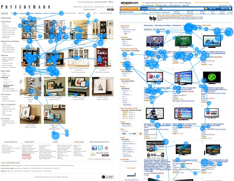
On the left is PotteryBarn and on the right – Amazon. Research results show that PotteryBarn visitors pay more attention to the thumbnails. On Amazon only 18% of the visitors pay attention to thumbnails and the rest 82% focus on the product description.
You may ask why that is. Take a closer look! While thumbnails with TVs are not representative and do not display any settings around the item, PotteryBarn thumbnails are vivid and palatable for the eye.
Consequently, it’s better to see a product in an attractive setting than read a description a dozen times. That applies when products in the given category are distinctively different from each other and have a simple function.
When products are multifunctional and look similar, you should make your summary cards more informative: include main parameters and product ratings under the item alongside a short description.
Mistake #2. Inadequate Thumbnail Size
Thumbnails in your catalog catch the attention of your visitor… or chase them away when the picture is too small.
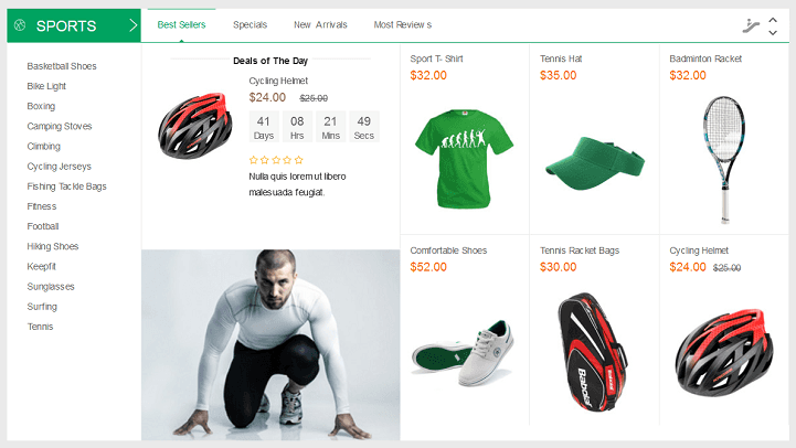
Of course, a lot of items don’t need big pictures. For instance, take a look at this screenshot of a Sports category – it’s hard to mistake one item with another or fail to spot it.
Now let’s take a look at another product category of the same online store. Can you see this maraschino dress and decide if you want to spend time looking for the details?
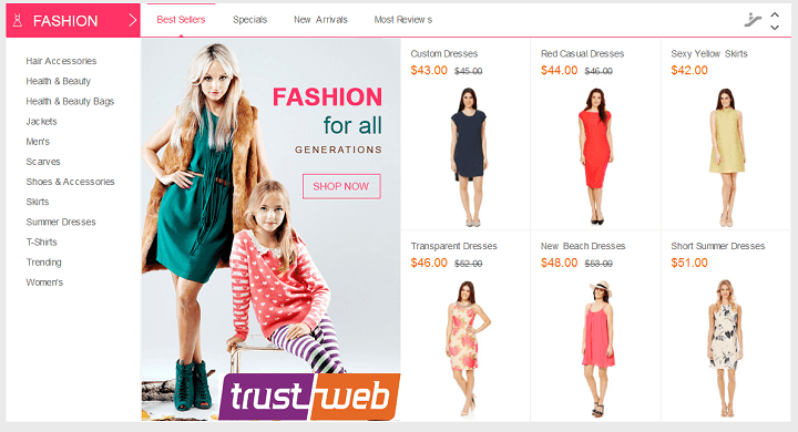
A recent tendency in online fashion retailers is to use authoritative thumbnails with big eye-catching pictures to reinforce the value and benefits of each item.
Look at how successful fashion retailer Mango does it:

Consequently, it’s always better to use detailed close-up shots of the product if its looks are its main asset. Being a living example of the latest successful trends in eCommerce marketing, retail is not the only category where looks matter.
Mistake #3. No Personalization in Search Results
Small and mid-sized online stores rarely remember that the search process is part of effective sales instruments. Stop and think for a moment – is the search function on your website just a simple software patch to make up for the complexity of your product catalog?
Like at this website below?
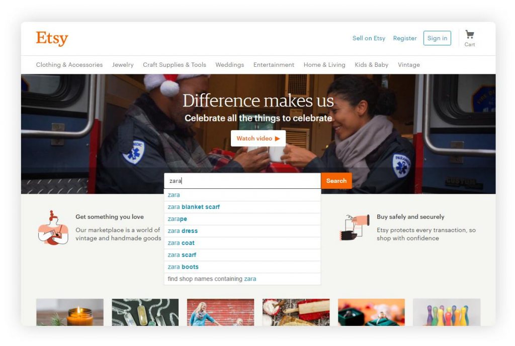
What if instead of ordinary matches for the search query you could determine what your visitor wants?
To see the transformative power this has for online businesses, examine the case of BrickHouseSecurity!
BrickHouseSecurity decided to convert ordinary search into a search with personal product recommendations and this resulted in an avalanche of new orders.
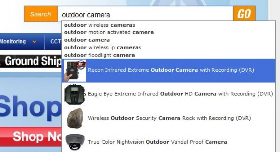
Can you spot the difference? Not only does the search function includes a visual incentive with small product cards but it displays best matches as well (yes, we can really do that- with our REES46 Progressive Personalization algorithms).
This search boosted BrickHouseSecurity’s conversion rate up to 100%.
Consequently, the search function is a powerful sales instrument when enhanced with Progressive Personalization and dynamic recommendations.
Mistake #4. Shady Customer Reviews
Accurate Customer Management is an important aspect of the success of your ecommerce marketing plan.
Just consider this fact: customer Experience Management (or CEM) research predicted the industry is projected to grow from $3.77 billion in 2014 to $8.39 billion in 2019.
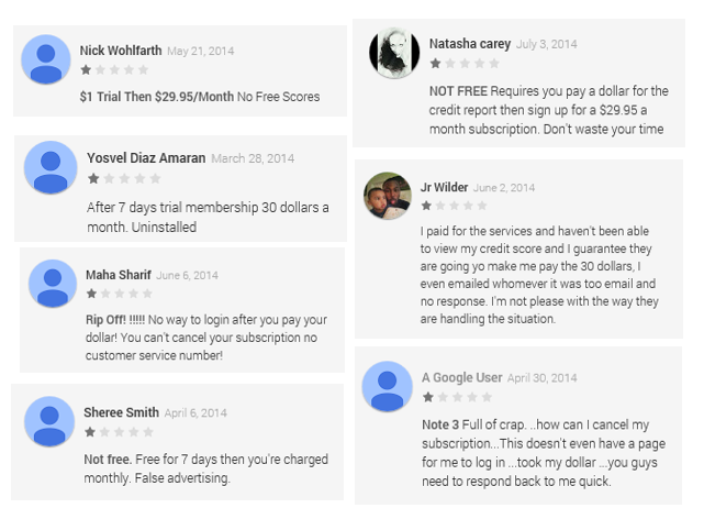
Lots of online stores post fake customer reviews to look more appealing (or to slander a competitor). But you can always tell fake from genuine reviews based on the similarities in style and word choice. Fake reviews are easy to spot as they don’t have a link to a customer profile, so there’s no fooling the savvy consumer…
Here is an example of this detrimental practice:
As an online store, you can also manually search for customer testimonials on social networks and connect with your customers through email or phone.
Or read “7 Creative Ways to Get Customer Testimonials” by Kissmetrics.
While this approach won’t let you build a trust-network to connect with and bring customers together – everybody will understand you’re publishing only what’s best for your brand.
Real trust-networks let you reach out to the customer and understand what’s on their mind. They also tolerate a dose of negative feedback as numerous research campaigns show that customers tend to develop more trust for websites with both positive and negative reviews: the latter prove there are real customers behind the words. And they allow customers to communicate with each other through the reviews as well.
Consequently, a trust-network is an effective solution for reputation management. This kind of network works both ways and enables you to automate the feedback gathering process, displaying only favorable reviews on your pages, and allowing your customers to browse through the whole list of reviews of negative and positive testimonials to reply to one another.
Mistake #5. Abandoned Carts Stay Abandoned
Abandoned carts are a weak spot for most online stores and a real pain for eCommerce. Typically, online stores take up a single practice – either sending triggered emails or showing abandoning visitors banner ads in affiliate networks.
This is not nearly good enough as both of these two instruments have visible flaws:
- Triggered emails often contain a block of text and a link to the cart. This looks more like a distraction than an incentive.
- Typical banner ads are not dynamic enough and appear long after the purchase has been completed. Not many visitors appreciate an annoying stalking banner constantly popping on numerous websites when they have already bought the item.
A good practice is to show relevant suggestions in banner ads. Triggered emails should have a more responsive “interface”.
Consequently, banner ads can be much better retargeted to display dynamic product recommendations. Emails should include a form to complete the purchase right from the letter.
If you use banner ads for remarketing, at least make them effective and design them to exclude the item from the ad when it has been purchased.
Mistake #6. Slowpoke Announcements

Flash sales, deals of the day and other time-sensitive events are one of the main 2016 eCommerce trends and it looks like they are here to stay. You’re bound to get on board simply due to their effectiveness as they have has been proven to stimulate spontaneous purchase, SMM and revenue generation.
But time-sensitive events have one major flaw – they are limited. They have a short lifespan and must be circulated asap. Choosing email marketing in this case equals to failure. You must employ a faster, more advanced digital channel. Here is where another 2016 eCommerce trend steps in – Web Push Notifications.
Consequently, to notify your customer in time about a recurring time-sensitive event, use a faster digital channel with better delivery rates – Web Push Notifications.
Mistake #7. Something Went Wrong and It Is Targeting
How often do you see an ad that has zero relevance to your interests?
Would you believe that the following ad was displayed to a man browsing his facebook newsfeed?
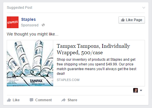
One thing is guaranteed – if you don’t target your audience the right way, the only thing you will get is zero sales.
Moreover, in different product categories you must consider different product and customer characteristics as part of your ecommerce marketing strategy. The number of these parameters can be as large as 30 and include very specific elements. For example, in Cosmetics & Beauty Products, age and gender are not sufficient to target a product, and you must know skin and hair type, skin and hair condition (greasy, normal, dry, mixed type), predisposition to any allergies and even personal preferences to position a product successfully.
For specific product categories there are specific Niche Solutions that are designed to result in stellar performance in the given category.
Consequently, a solid business decision is to use marketing platforms that have this functionality and are designed to boost the full performance of your online store. It’s time to think how we can help you achieve this.
Overall Conclusion
Every starting eCommerce business faces a pile of nerve-wrecking decisions and options on its hands that will either make or break its success. It can truly be overwhelming. But it doesn’t have to be!
Marketing automation is a loyal and silent assistant that is always by your side and ready to provide a safety net every time you stumble. This is the time for you to finally reach and take the helping hand, keeping in mind that success is a team effort.
